Following my concept designs i began looking at possible combination of colour palettes i could use for my website and app based site. Having a few good colour palettes is crucial for my design as there is the option to customise the colour scheme for web and app, various colours schemes that would suit the target audience is needed.
I had a look at Adobes service Colour.adobe as it is a large database of user created colour palettes for almost every design style. I picked out a varied selection that i think would suit my dashboard design.

The above colour palettes are the ones I personally found most appealing as I feel there is a style here that would represent most peoples personalities and preferences.

After showing the initial colour palettes to a focus group made up of my target audience the above colours were the ones that they were happy with.
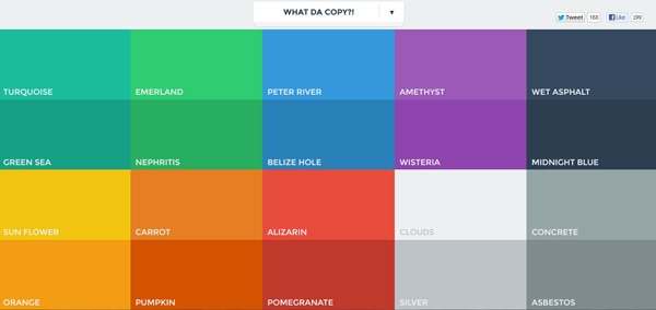
In addition to this i also Looked at Flat UI Design. This links to my project as plan on utilising Flat UI design in my finished projects as I am going for simplistic minimalistic design. Reasoning behind this is that as most dashboard design’s are normally made up of small individual components, having a complex colour scheme will only detract from the idea of a minimalistic style and dissuade the user from the project.
Flat UI is normally used to create drop shadow effect which has a big impact on creating depth without being to imposing.
Examples of various flat UI is: