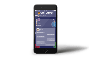
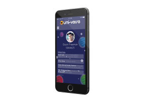
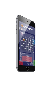
The attached file is my PDF featuring my stylised concepts and also my personal reflection.
All posts by Benjamin Adams
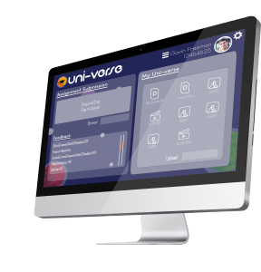
Final Web Design
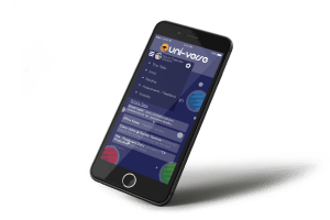
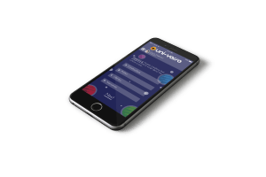
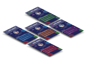
Final App Design
Presenting in templates
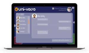
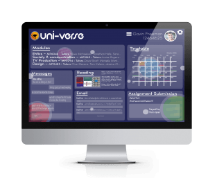
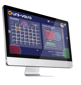
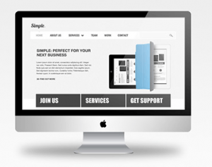
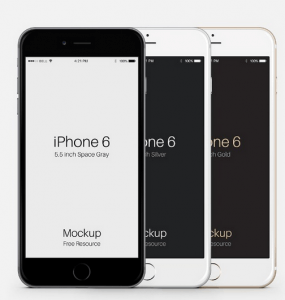
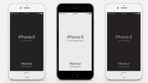
I began to research into using templates properly as i began to finish with my design development. This was because I had but a lot of work into making the individual pages good so I wanted to make sure it looked professional when i put everything together. I liked how the I was able to get templates not only for the webs side of my work but also I was able to get templates of iPhones to showcase the app side of my project. It not only promote the feel of the views it also helped make my mock ups look interesting to look.
Focus Group Review
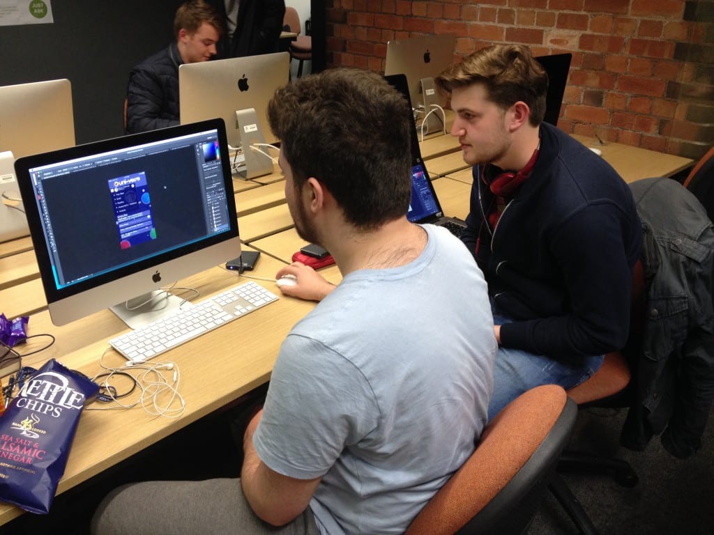
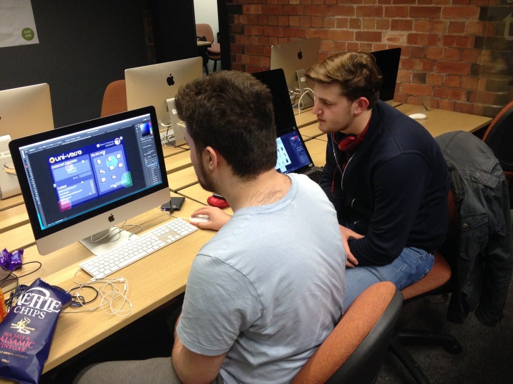
I showed some of my developed designs to a focus group of students in the library for them to have a look at and i received some interesting results.
One of the key pieces of feedback I received was that my menus started off as being semi transparent. I was told that not only was this distracting as it was hard to read. But as well as this the processing power it would require to support would be to run on a mobile phone would be to much.
The next piece of feedback i received was that on my page where i was showing how the quiz would work on the phone. I was told that the page was to cluttered and over crowded and that I should reduced it down to one question per page to make it easier to read and use.
Due to feedback I had to make sure that I dial back one of the glare effects featured on one of the templates as it was to bright and was obscuring the image.
Later on i asked my tutor during my workshop if there were any particular features that needed tweaking and the main point was that the icons I had created for the online storage demo for the website were too bright and looked like they weren’t part of the website.
I will incorporate these pieces of feedback into my further designs, which will ultimately sculpt my finished pieces of work.

