Category Archives: Year 2 Semester B

Development of App concept


These images below are some of the initial designs I have done. I am very happy with these designs as i feel they look professional and represent my design featured in the brief.Appmenuv.1

This design above is the one that the user would first see when they access the page.

quiz


This design is the layout that will be featured for the quiz aspect of the app.

These are the designs i have created as of yet. There will be more views that I will use for the realisation PDF.

Ways of Presenting Work

As part of my development I looked in to ways of presenting of App design and website based interface.

Click on the images to enlarge to view layout

App Design

dfd37616ccb1c087953a40d6ceb8e59b

I was a fan of how this website/app was presented as it was a minimalist but an effective way of presenting. I especially liked how the previews of the website and app were presented in a way that they weren’t wrapped with a template of a phone or a computer screen. This only added to the simplistic design.

However though the colour scheme is to dark to be used for my style as as seen in my Research and Development file my colour scheme consists of a lot of deep blues and contrasting oranges and yellows.

f3089c52073773d68a13517eadeb0ef8

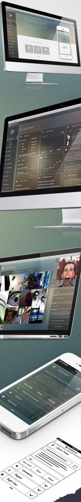
The above design is a different take on how App design can be presented through the use of photo- realistic iPhone templates to highlight how it would look in real life. In addition to this it shows each aspect of the app really well by on each template showing a different area of the App.

The colour scheme used as well is very sleek and modern which can be applied across a range of various design styles / themes.

Web Design

 85bcc684ee1de69e98137de5e5e07045

This method of presentation is very similar to the previous App based layout as it incorporates the use of  photo real templates to highlight how it would be seen in real life. I like the simplistic style as it makes you clearly focus on the actual product previews.

3be1a49c6c09ad976e03a8a0cfdaf4a7

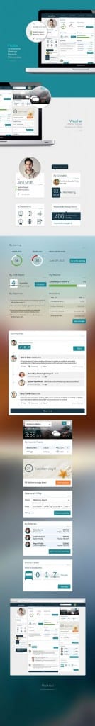
This layout interested me as it goes into a high level of detail of what is included in this website and then breaks down each aspect into their individual parts so that they can be viewed easier. In addition to this it once again features the use of templates to signify what it would look like if someone was viewing it. I do like how it has incorporated lots of  images the describe the website and the text that provides lots of detail.

c0575ca9e47e327631b80e0ef0e2f839

Finally this method of presenting work interests me as it utilises a mixture of everything to get he point across. It has templates of iPhones to show that aspect, text and arrows pointed towards individual sections to highlight particular aspects that are important to highlighting the overall design and features. I will most likely incorporate this into my design as the text backs up what my images are trying to say.
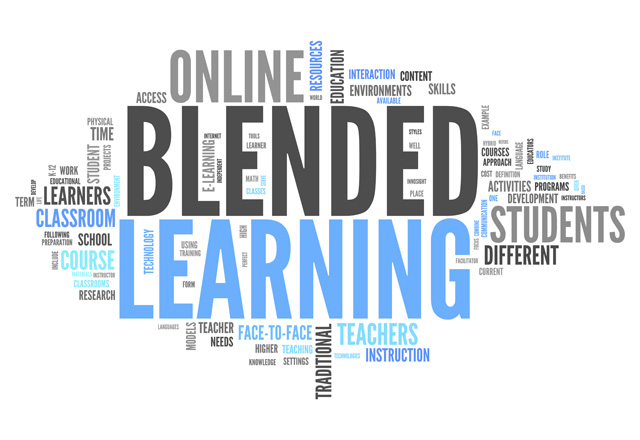
Critical Review – Adobe Education Exchange

Adobe Education Exchange is a online service provided by Adobe. It focuses on delivering free learning to anyone with an Adobe account. The courses ranging in variety from examples such as Game design all the way through to publishing.

Education Exchange Pros:

  • Education Exchange features a good use of online learning as an individual you can sign up for courses specific to what you want to learn.  In addition to this is also utilises the online live lecture/workshop format that can be re-watched if either missed or if needed to recover content. The online lecture format also is good because it allows users from all over the world to come together to collaboratively peer review each others work. The final point of why online learning is good in this sense is because it is all online people can do it from the comforts of their own homes or during a lunch break at work.
  •  The next point is that it uses gamification (using game elements such as scores and achievements in other element of life) to persuade user to motivate them selves to do better and to keep coming back.
  • One of the main point of Education Exchange is that is has thought about the user’s Experience (UX) when navigating the service.  I found this out when using the website that it was very user friendly and the various tabs were clearly labelled.

Education Exchange Cons:

There were very few downsides to Adobe Education Exchange but one of the major points was that it is very exclusive as to acess the service you need to have an Adobe Creative Cloud Account which can only be accessed by either purchasing or though an University  package. This does limit the audience by a considerable amount.

The second key factor that i noticed when using Education Exchange was that when peer reviewing other peoples work you need to download the file to view it and then fill out the review online, obviously as most of the files will consist of a considerable file size this may take awhile if you have to keep repeating this.

How i’m going to use the data to further research and design (inform my own work)

The information i have received from this review will help me in the design stages of my project as features used in the Eduction exchange have informed my ideas on what concepts work and what doesn’t. The use of the online learning is something i definitely want to incorporate into my work as i want to create a service that people can access no matter where they are and learn either live or on catch up if they need to. In addition to this the use of live discussion boards will help my project as i can link this into lectures so if a individual has a question that another student knows the answer for they can help out. Following the collaborative route the use of peer review in work is highly interesting as it promotes teamwork between students and also develops a students skills to critically evaluate other work. Finally i would also like to blend the use of gamification into the project as well as another methods of constructive motivation.

Screen Shot 2016-02-28 at 23.57.52

Screen Shot 2016-02-28 at 23.59.17

Screen Shot 2016-02-28 at 23.58.03

Screen Shot 2016-02-28 at 23.59.33

Screen Shot 2016-02-28 at 23.59.58

Screen Shot 2016-02-29 at 00.00.56

Sources

https://edex.adobe.com/

Blended Learning

Blended Learning is a relatively new format of Education as it combines the use of traditional learning with modern technology to support education. Blended Learning doesn’t just replace a lot of traditional methods it combines the strengths of both to deliver a much higher standard of learning.  An example of blended learning would be a lecture that is recorded by the tutor and then uploading that online for all the students to view and access when they want. An article i found highlights a few Pro’s and Con’s of blended learning below.

Pros

  • Collaborative learning experiences. Collaboration between the students and instructor can increase substantially via an online training platform. With many collaborative tools (online discussions, blogs, instant messages, etc.) the students are able to connect with each other in or out of the classroom.
  • Increased accessibility. Improves access as well as student attitudes towards learning. The students are given the tools to access the course materials anytime, anywhere.
  • Better communication. Communication is improved between lecturers and part-time/full-time students. An online training platform can provide many communication tools such as news announcements, e-mail, instant messaging, online discussions, online grading tool, dropboxes, and more.
  • Successful evaluations. Better student evaluations via the use of online testing and assessments with reporting features. Often times, the students can evaluate themselves better as well with immediate grading or feedback.

Cons

  • Strong technological dependence. The tech resources and tools need to be reliable, easy to use, and up to date in order for the use of the Internet to have a meaningful impact on the learning experience.
  • Lack of IT knowledge. IT literacy can serve as a significant barrier for students attempting to get access to the course materials. The availability of technical support is a must.
  • Students can fall behind. The use of lecture recording technologies can result in students falling behind on the material. Nearly half of all students will wait and watch several weeks’ worth of videos in one sitting, rather than on a regular basis.

 How i intend to use blended learning in my own project

I Intend to use the idea of blended learning in my project as I feel that the use of features such as online lectures/ workshops will be vital to a service aimed at university students, In addition to this the digitization’s of university libraries supports students learning as well because it means particular academic texts can be read from the comfort of some ones bedroom and it also removes the danger of someone else already checking the book out before you.

The video below cover the fundamentals of Blended Learning:


Sources

http://www.digitalchalk.com/blog/pros-and-cons-of-blended-learning

https://www.youtube.com/watch?v=3xMqJmMcME0

Further development of App design

As part of my development I came up with some design mock ups for apps based and Web based design it was through this that I  could see what worked well and what didn’t. Below are some the designs I came up with:


iphone green mock up


This design was test to see who the idea of a swiping left and right interface would look like. As it is a swiping interface the ease of use is very low meaning that any one could easily use the design. I do how ever like the simplistic design style and would really like to incorporate it into my final design.


iphone orange mock up

On the other hand, the orange design features a more rigid menu style similar to blackboards. I like the formal layout of this but unlike the green design it lacks ingenuity.

blue web mock up

This design in particular was my attempt at a layout for dashboard design. I took into consideration the results from my survey on what features are regarded as most important. For my website I am likely to take most inspiration from this design into my final design.red web mock up

My second and last design for the web side of my project features a style commonly found on photography blogs as it features a large open space for a graphic of some sort and a drop down menu to the left. This design promotes a simplistic and modern feel to compared to the cubic dashboard design.