I started a Padlet which is an online mood board creator, it highlighted some of the main aspects of my what my project idea would need to cover for it to be a successful project.
The link highlighted below is the access to that Padlet:

I started a Padlet which is an online mood board creator, it highlighted some of the main aspects of my what my project idea would need to cover for it to be a successful project.
The link highlighted below is the access to that Padlet:
Following my concept designs i began looking at possible combination of colour palettes i could use for my website and app based site. Having a few good colour palettes is crucial for my design as there is the option to customise the colour scheme for web and app, various colours schemes that would suit the target audience is needed.
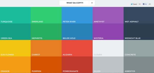
I had a look at Adobes service Colour.adobe as it is a large database of user created colour palettes for almost every design style. I picked out a varied selection that i think would suit my dashboard design.

The above colour palettes are the ones I personally found most appealing as I feel there is a style here that would represent most peoples personalities and preferences.

After showing the initial colour palettes to a focus group made up of my target audience the above colours were the ones that they were happy with.
In addition to this i also Looked at Flat UI Design. This links to my project as plan on utilising Flat UI design in my finished projects as I am going for simplistic minimalistic design. Reasoning behind this is that as most dashboard design’s are normally made up of small individual components, having a complex colour scheme will only detract from the idea of a minimalistic style and dissuade the user from the project.
Flat UI is normally used to create drop shadow effect which has a big impact on creating depth without being to imposing.
Examples of various flat UI is:
Once i had developed my research further i began to look at initial concept mock ups using Wireframe.cc to have a look at what some of the designs may look like on computer and also on mobile devices as well.
Web design layout 1

This design was created before my survey results were collected so I based the design on what features I feel were considered most important. I went for a very typical use of dashboard design , where each section is very modular in relation to other features.
Mobile design layout 1

This design consists of using a central home page with links to other pages that are accessible through icons on the home page. In addition to this if already on a other page the menu at the bottom can be slid left and right to access other icons.
Web design layout 2

This design is similar to design style number one but features a more organised modular design with equal spaces for each feature. This design consists of a basic layout with serves more for functionality rather than aesthetic. It features a intuitive design that students will be able to easily use.
Mobile design layout 2

This design featured an easier Ui as with larger buttons it is easier for users to choose which area they want to navigate to using just one hand. The icons will open up to a new page for the feature once again allowing ease of use for the user.
Web design layout 3

This design was inspired by websites I have found that have the majority of the website menu links on the left hand side which leaves space for a large image. Which is visually appealing to audience members as it doesn’t look to imposing. On the other hand after reviewing this design I have found that it doesn’t follow convention’s of dashboard design as common dashboard use the entirety of space available.
Mobile design layout 3

This design is probably the simplest of the mobile concepts as the changing feature transition is simply a swipe of left or right once to another page, again sticking with the easy Ui allowing users to operate with one hand, meaning users can use the app on the move.
As my Email correspondence received inconclusive results i created a survey using ‘Survey Monkey’ to gather more research into what my target audience thought of blackboard and what features were considered most important.
The questions that I asked in my survey are listed below:
The link to my Survey is below:
https://www.surveymonkey.co.uk/r/ZBCM5NS


Analysis of Results
I received a selection of results from my survey which revealed some important features that will be invaluable to my research and the development of my project.

From looking at these results I discovered that the majority of responses viewed blackboard in a negative view or that people were forced to use it as there is no alternative offered through the university.
These answers support my project to develop a new and improved form of online university education portal.

Once again the results of this question support my research into the ability to individualy customise colour schemes. This is positive as it means I can further my research into colour palettes and what style appeals to my target audiences.

The results for this question were inconclusive as everyone of the people who responded to my survey knew there was an app but what intriged me the most was how people use the app or why the don’t.


The responses I received on majority viewed the app in a negative view. Some of the feedback i got consisted of “Yes, but found it was very difficult and not easy to navigate. I didn’t find the app useful at all.” and “I used it then deleted it immediately after due to its lack of functionality.”. This feedback proved useful as it meant that as part of my product I needed to create an app that works alongside my Website and is easy to use.

I found the results from this question rather interesting as 50% of my results said It was easy to submit work and 50% said it wasn’t. Some of the feedback included “There are lots of unnecessary rules you have to abide by: 2cm and 3cm margins, double space, and .doc file – it would be easily readable without all these and in a pdf format.” . So in response to my project I want to make sure the feature for submitting and viewing feedback is user friendly and easy to use as this will improve upon the user feedback about blackboards submission feature.

The general consensus of results highlights that the site is very much broken down into layers of chains. So for example if you are looking at a specific module you will go through multiple layers until you get to what you need to find, this aspect of navigation is good. However though the problem arises if you want to go back or need to look at something different most of the time you will need to go back to the homepage, then repeat the same process for different module. So linking back to my project i will try to design a more fluid navigation system for web and app. This will most likely consist of drop down menus that appear when the mouse hovers over the header.

I carried out this question for the fact that when it comes to the dashboard design of the websites what areas I will need to highlight to make important and what areas are not as important. From my responses i found that the assessment and feedback section will need to be one of the largest compared to the option for discussion boards which was considered one of the least important.


For my last question I left the answer open to the individual filling out the survey. The responses I recived proved highly useful as I had responses for features that I had completly overlooked. Some of the features include and instant messaging system similar to Facebook so at the start of the year if individuals are in groups for work they haven’t got to search through sites like Facebook to find and add them as friends, this also removes the factor if someone doesn’t have Facebook they can still be in the loop. Another feature I thought was a really important feature was the option to edit and add items to the timetable feature, so students can plan around their timetables and studies.
In conclusion out of all the methods of research I have looked at this survey has delivered with the most relevant information that will most likely go on to develop my project for the better by allowing it to respond to real user feedback and problems.
I tried to find out information that I could use to inform my research in to how blackboard is used specifically in Lincoln University and how each separate school might use it differently. I emailed Kerry Pinny who is the University of Lincoln Digital Education Developer.
Unfortunately the information I needed wasn’t accessible as there were certain privacy restrictions and the data isn’t tracked by individual school’s.
This process wasn’t a waste of time however as the email conversation allowed me to refine my idea and force me to carry out extra research regarding focus groups.
Click Image to Enlarge to See Email Chain
