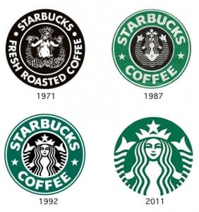
The Logo of Starbucks has evolved throughout time due to it needing to become more modern and keeping up with current design movements and cultural themes. As time progressed from 1971 to 1987 the detailed hand drawn image that showed female nudity was removed most likely due to new regulations for branding. Further more from 1987 the iconic colour green was introduced to bring in a bit of variety to the black and white logo. Between 1992 and 2011 the logo became more simplistic and stylised as i mentioned earlier to keep up with modern times.

