The work we were set to carry out during the week was we were tasked in groups to interpret a brief we had been provided with and design logos influenced by style we like that would fit the brief ready for the workshop when we then created them using Adobe Illustrator.
My interpretation of the brief is as follows:
“We have been tasked with creating a industry standard logo that needs to be professional and versatile whilst still being fun and appealing for a domestic animal behaviour centre. After reading through the brief i have discovered that the centre have 4 pillars that they would like to pride themselves on and these are: Respect, Understanding, Education and Positivity. The brief also covers descriptions of what the organisation provides, this is so that the designer can get a background idea of what is expected by the client”
Before i started designing any logos i carried out some research into different designs that i liked:

The selection of images above where a source of inspiration for me. The first images which are made up of colourful segments of geometric circles was a innovative idea as it whilst still being simple has a very strong effect as it is clearly achieves its purpose to create a variety of different animals. The bright colours are good as well as it stands out without being too bright and garish. The second image appealed to me as whilst having a basic colour pallet of black and white which are two complementary colours the cat the incorporated into the outline of the dog work as it is catering to a large audience basis.
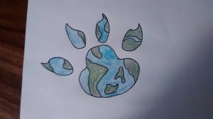
Before the workshop I designed this idea (image below) as the paw print represents the animal side of the clients brief and the detail inside the paw is meant to represent the world. The very simple colour of green and blue makes it fun and appealing to look at whilst still being professional as the client wanted. In a final draft of this i would use a actual image of the globe to make sure that the island land masses are geographically correct in addition to this i would also make it more rounded.
I then went on to create the logo digitally on Adobe Illustrator using the pen tool. It took me a while to get used to using Adobe Illustrator . I was very happy with the finished results.
[INSERT FINISHED LOGO HERE]